Food to Power
Empowering a food revolution
From their humble beginnings as a food rescue program to their current non-profit “organism” cultivating a healthy, equitable and thriving food system for all, Food to Power struggled to to tell the story of the breadth and impact of their work.
We worked with Food to Power to better represent their evolution and impact on the community, rebranding them to fuel their strategic work in transforming our food system into the future.
⛛ Brand Strategy
⛛ Naming
⛛ Copywriting
⛛ Identity Design
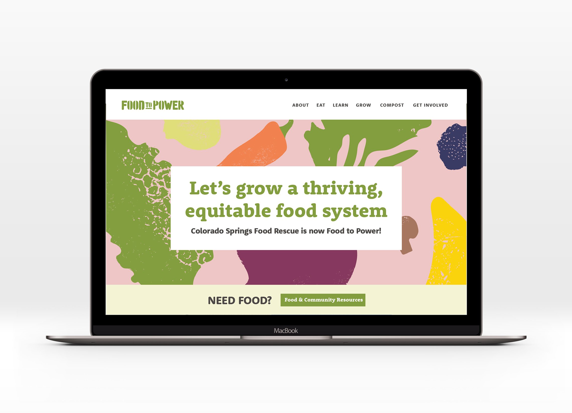
⛛ Website Design + Content Strategy
⛛ Environmental Design
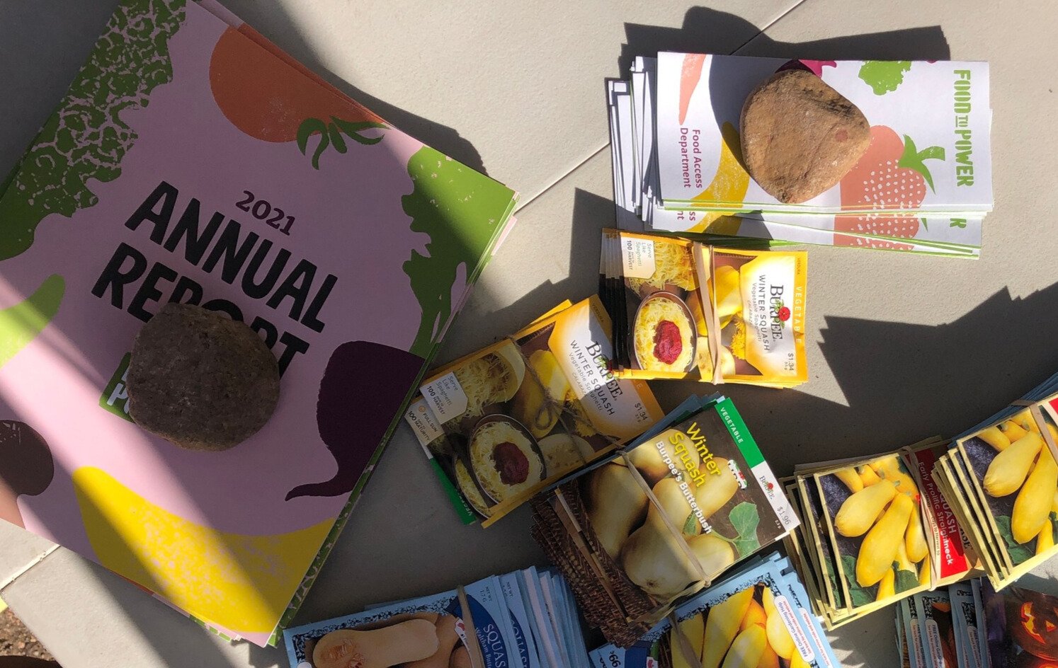
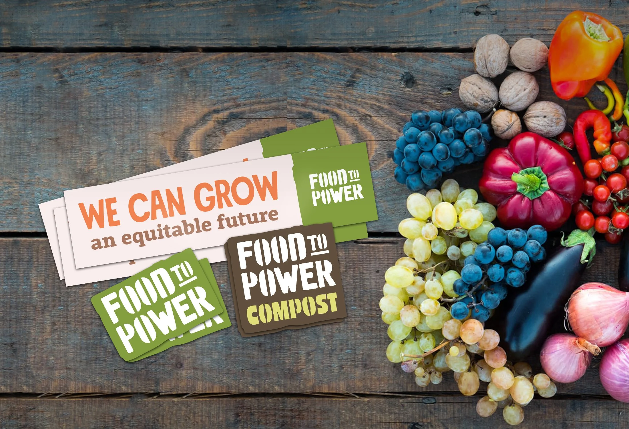
⛛ Marketing + Print
⛛ Apparel Design
⛛ Sourcing + Production Management
⛛ Brand Management Systems

Our goal was to create a vibrant visual brand that powerfully communicates Food to Power's compelling work and enhance their connections with the community.
By aligning our creative vision with Food to Power’s organizational goals, we were able to co-create cohesive branding that seamlessly integrated their programs around a strong, relevant narrative.

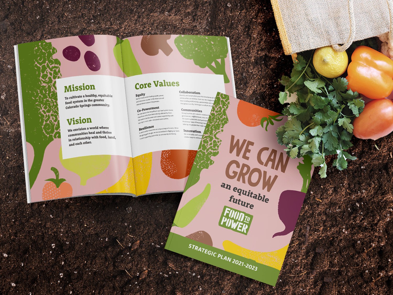
Brand STRATEGY
A common challenge we see for complex organizations is creating a cohesive brand system that meets current goals, yet also allows for consistency and building brand equity through future growth and added programming.
Developing their brand architecture was an early key tool in aligning future decisions in the rebrand design process and beyond.


IDENTITY DESIGN
To bring the rebrand to life, we applied our creative expertise to develop a comprehensive branding system with typography, color, and graphic elements that are visually bold and memorable, without being chaotic.
Rebrands inherently have to consider the role of current brand elements in the future brand. The previous logomark found a new home in the new logo for the flagship program that started it all, renamed to reflect a more equitable, inclusive lexicon.


BEFORE
AFTER
We illustrated a library of produce found on their farm using earthy textures that combine in infinite uses beyond a background pattern.
The color palette is inspired by the tone of colors founds in an abundance of harvest, and evokes a sense of positivity and energy.

The primary display typeface was inspired in part by protest-era posters and Food to Power’s DIY beginnings & ethos. We also utilized the typeface for their most visible program.
The result is a strong mark that remains visible and consistent across various touchpoints — including many that are frequently deployed by staff & volunteers through creative reuse methods.


Brand Development
Our brand-building process strategically involves the staff, board, and community to ensure that everyone has a role in shaping the narrative and making it truly reflective of their collective vision.

For Food to Power, this included leading the process of renaming the organization and programs to reflect their personality and mission of empowering and transforming communities through food access.
The result is a powerful name and story that reflects their personality (and subtly referencing the idea of speaking truth to power) and core mission — empowerment through food access.

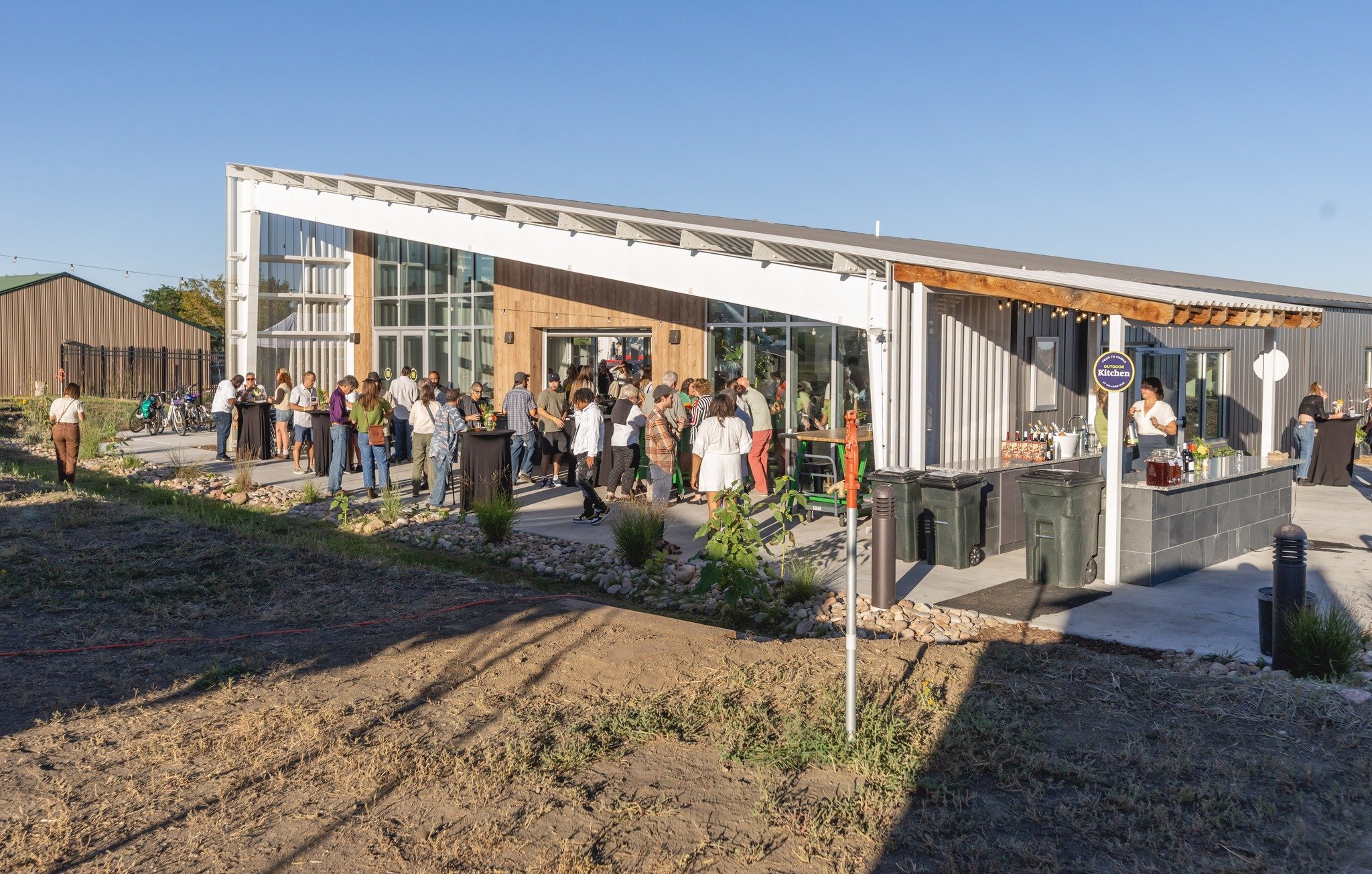

ENVIRONMENTAL DeSIGN
We designed, sourced, and produced all the environmental design for the Hillside Hub to facilitate the myriad programs, events and communications that happen onsite.

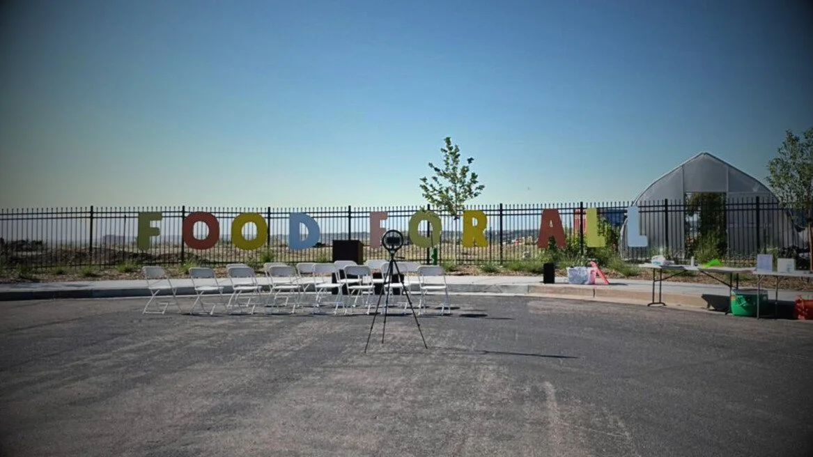
At the grand opening of the Hillside Hub, we also facilitated a community art project to create a striking installation at their entrance declaring their vision and inviting the neighborhood in a creative way. Food for all!


BRAND MANAGEMENT
One of the keys to successful brands is completely behind-the-scenes: a brand management system.
We created and onboarded their team to a digital ecosystem of guidelines, brand assets, and tools that allow Food to Power to efficiently maintain a consistent and impactful brand presence throughout all touchpoints.