
GOCA UCCS
Letting the art speak for itself
The Gallery of Contemporary Art at UCCS has brought contemporary art exhibitions and experiences to the community for over forty years. Each exhibition is carefully curated and presented, across two galleries and regional outdoor experiences, as well as dynamic programs. We have been their creative partner since 2017 to design all of their brand communications, marketing, exhibit branding, catalogues and GOCA Digital with the same high artistic caliber and inspiration they bring to their exhibits.
⛛ Art Direction
⛛ Branding & Titling
⛛ Print Design
⛛ Illustration
⛛ Photography


Season Broadside Catalog
Since this was the first year for GOCA being in the newly constructed Ent Center for the Arts they wanted to communicate the community coming together in this new arts space. Our inaugural broadside catalog for GOCA’s was envisioned as an art piece in and of itself.


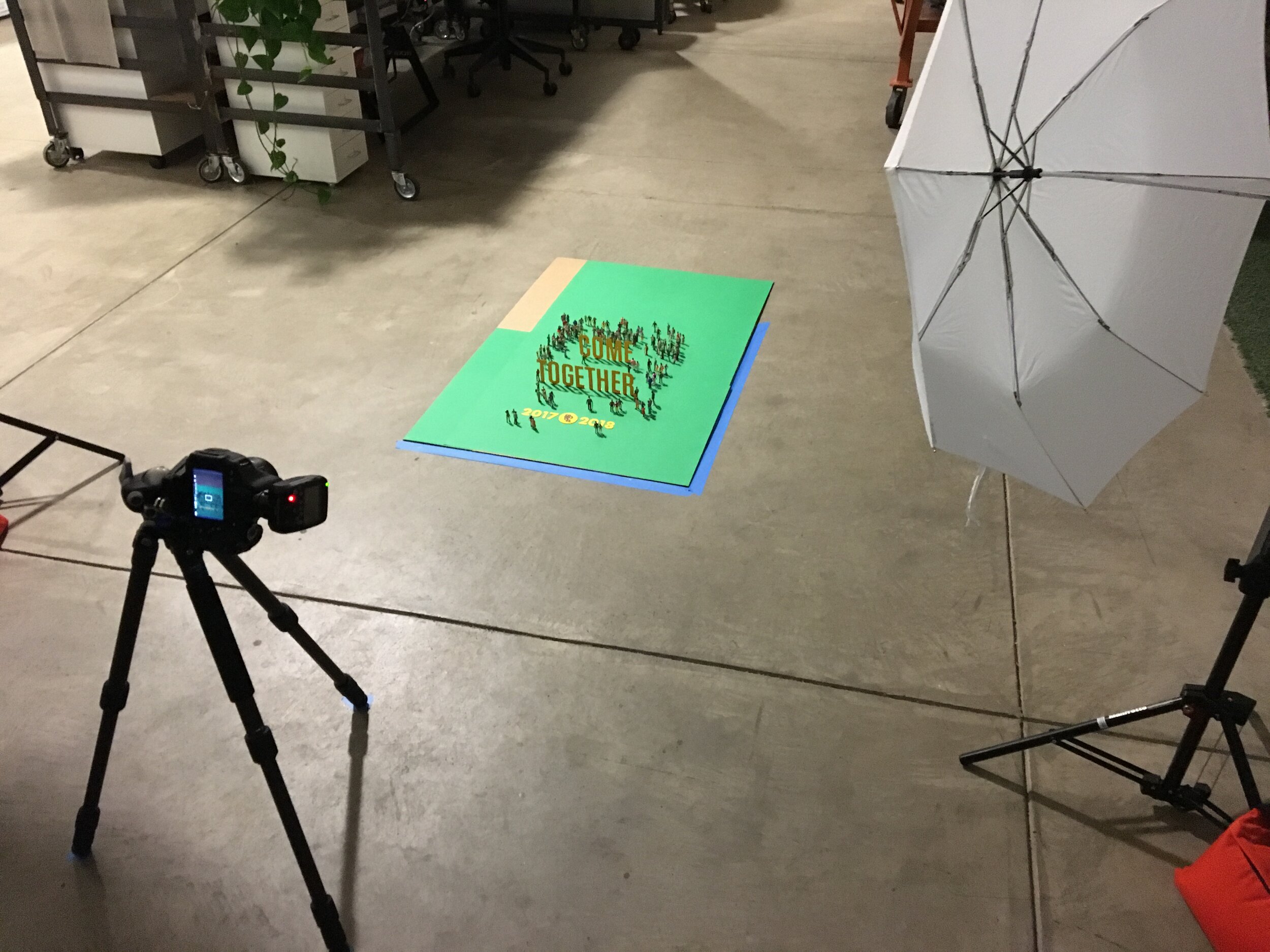


Since the gallery used broadsides for their catalogues, we liked the idea of continuing to use interesting papercraft in our concept.
We created a “set” using handcut paper, on which we could place miniature figurines to capture multiple scenes — including the iconic GOCA logo (designed by the talented Ellen Bruss).
In order to create diversity among figures (sadly, they all come as white-skinned, black-haired) we custom painted dozens of figurines in a variety of skin and hair colors before assembling the tableaus for photography.
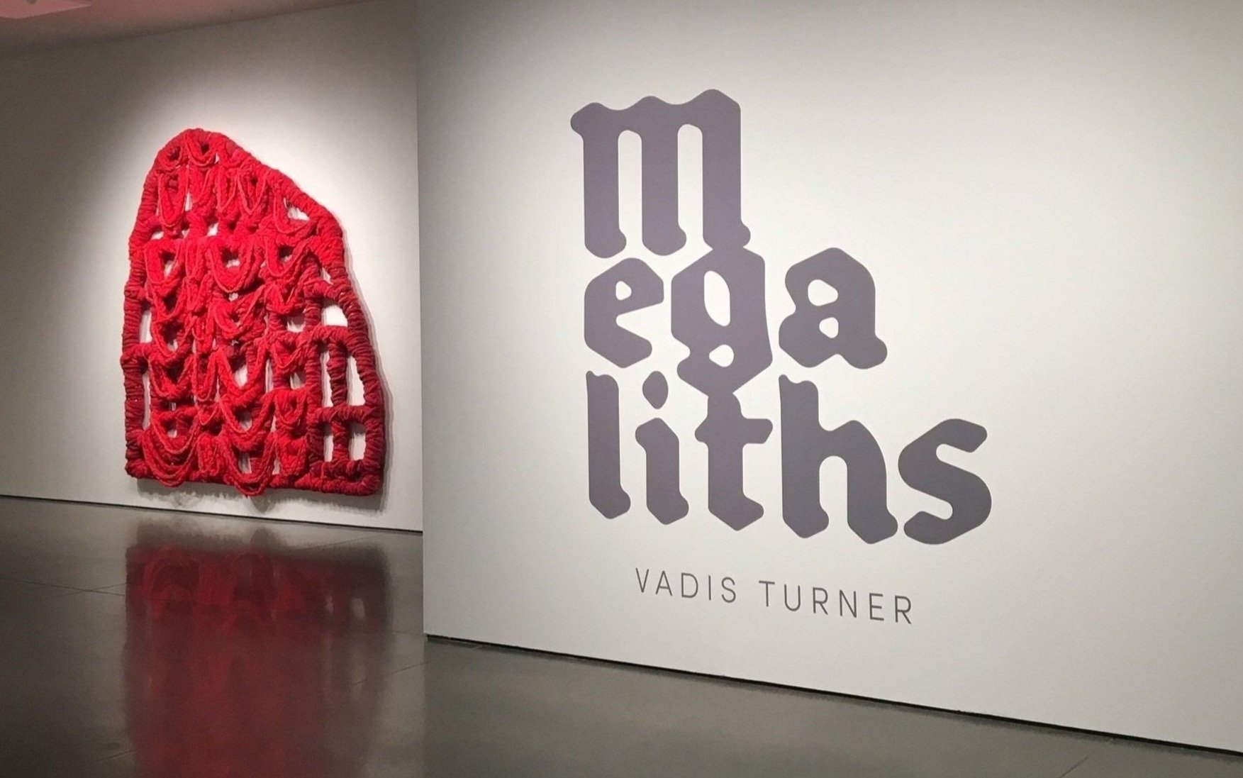
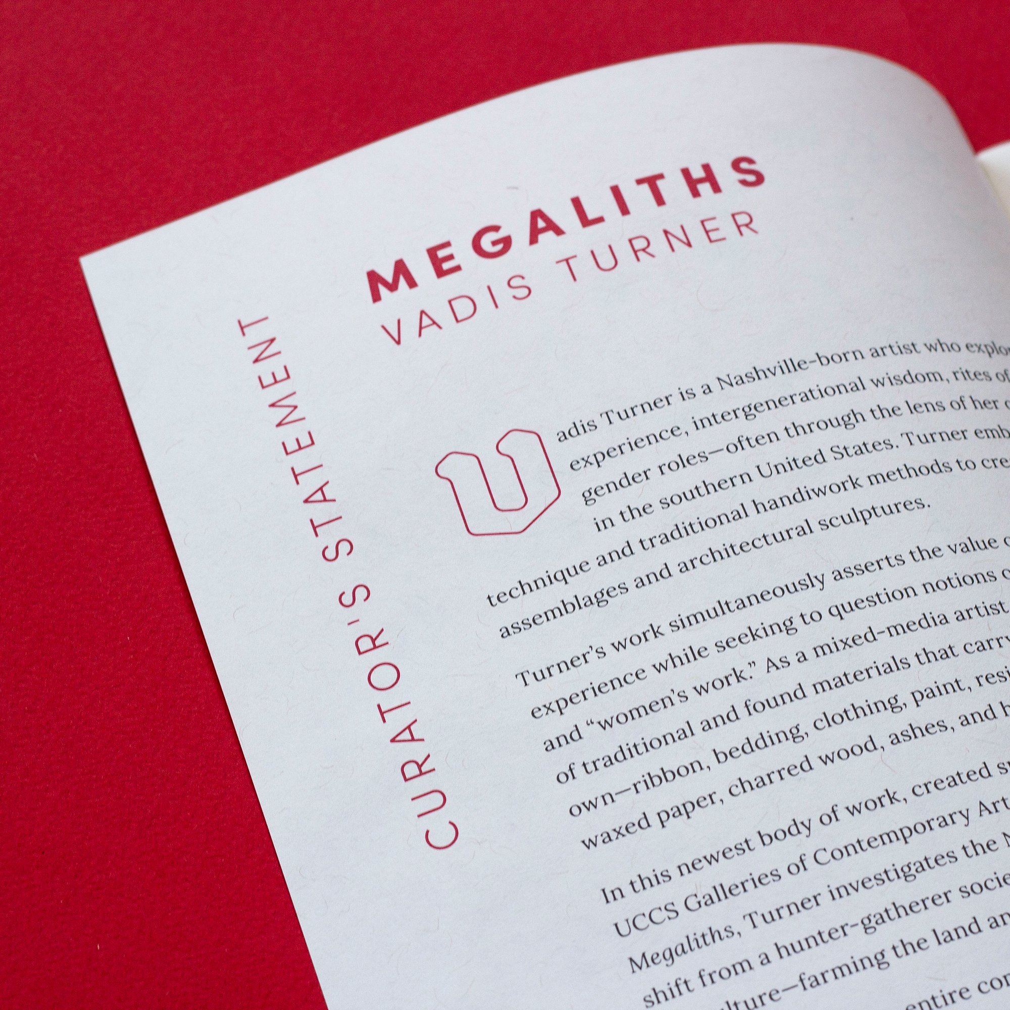
Vadis Turner - Megaliths
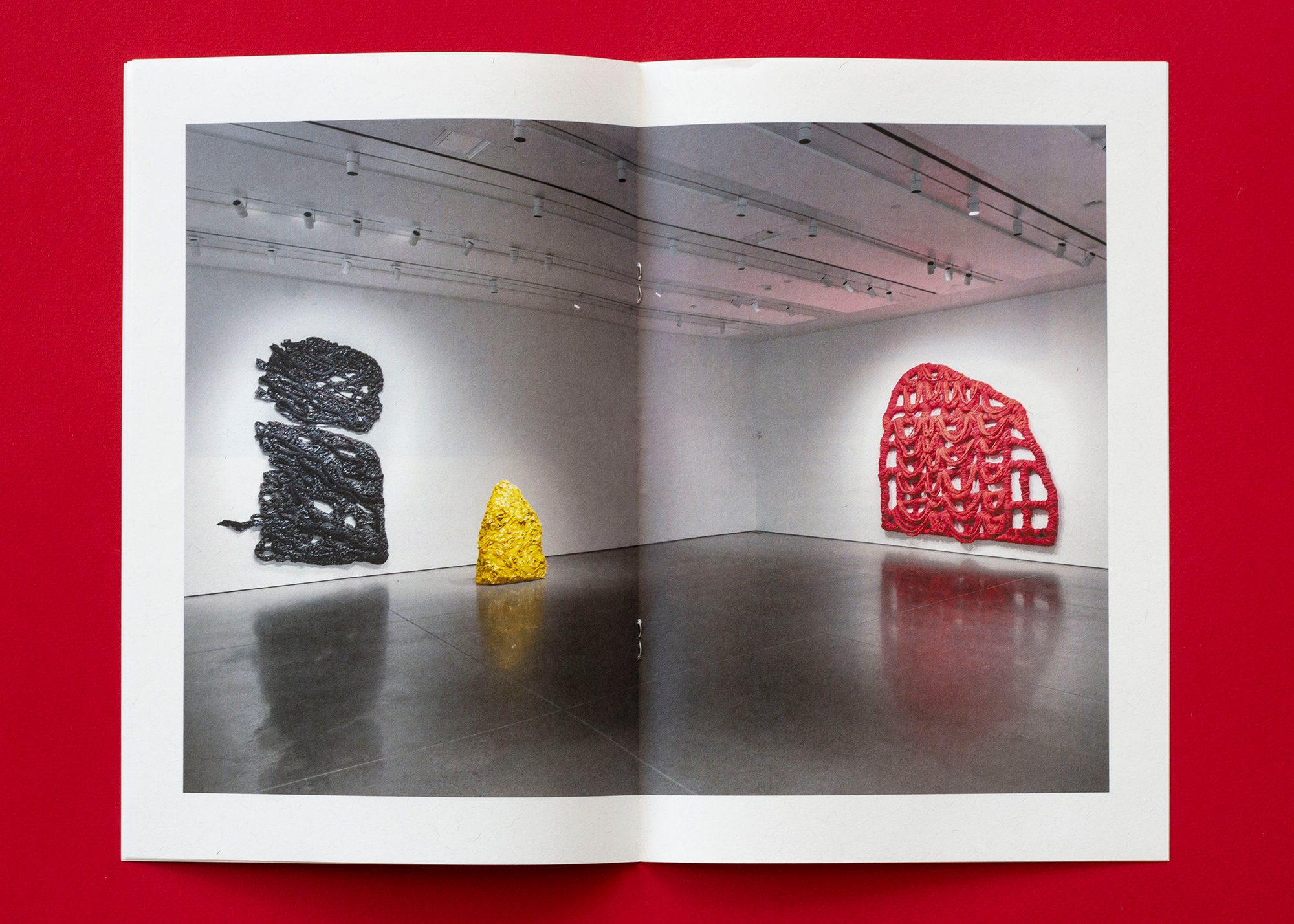
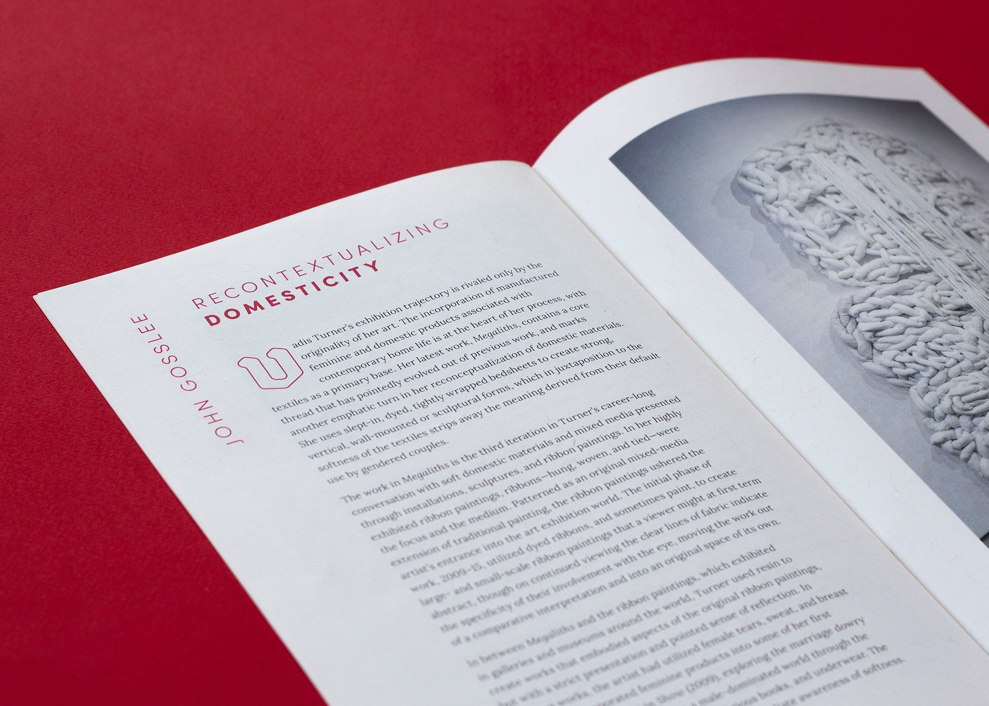
Nashville-born Vadis Turner is a mixed-media artist who creates lush, abstract assemblage artworks that explore the female experience, intergenerational wisdom, rites of passage, and gender roles through the lens of her family history in the southern United States.
These works are formidable installations, and the show titling using a customized typeface was designed to reflect the presence and weight, visually and metaphorically, of the artwork. Including the artist in the design process was important, ensuring that our design communicates their art authentically and complementarily, without being derivative.


Floyd D. Tunson - Janus
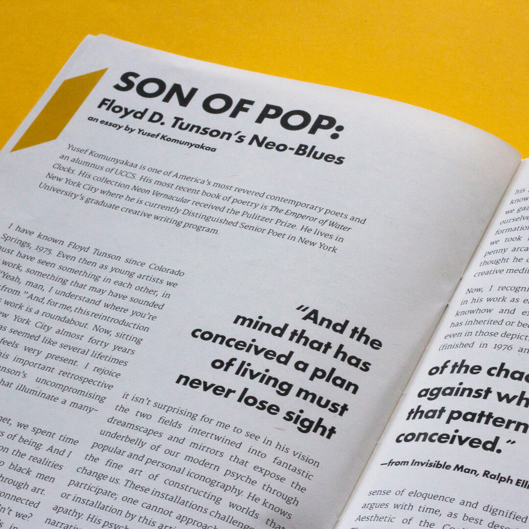
Floyd D. Tunson’s exhibit inaugurating the opening of the GOCA gallery in the Ent Center, Janus, makes art itself the subject of the art, highlighting elements of visual experience — line, color, form, and light. We used these elements to abstract the artists’ initials and split the work on the front and back of the catalogue.


Lazy Stitch
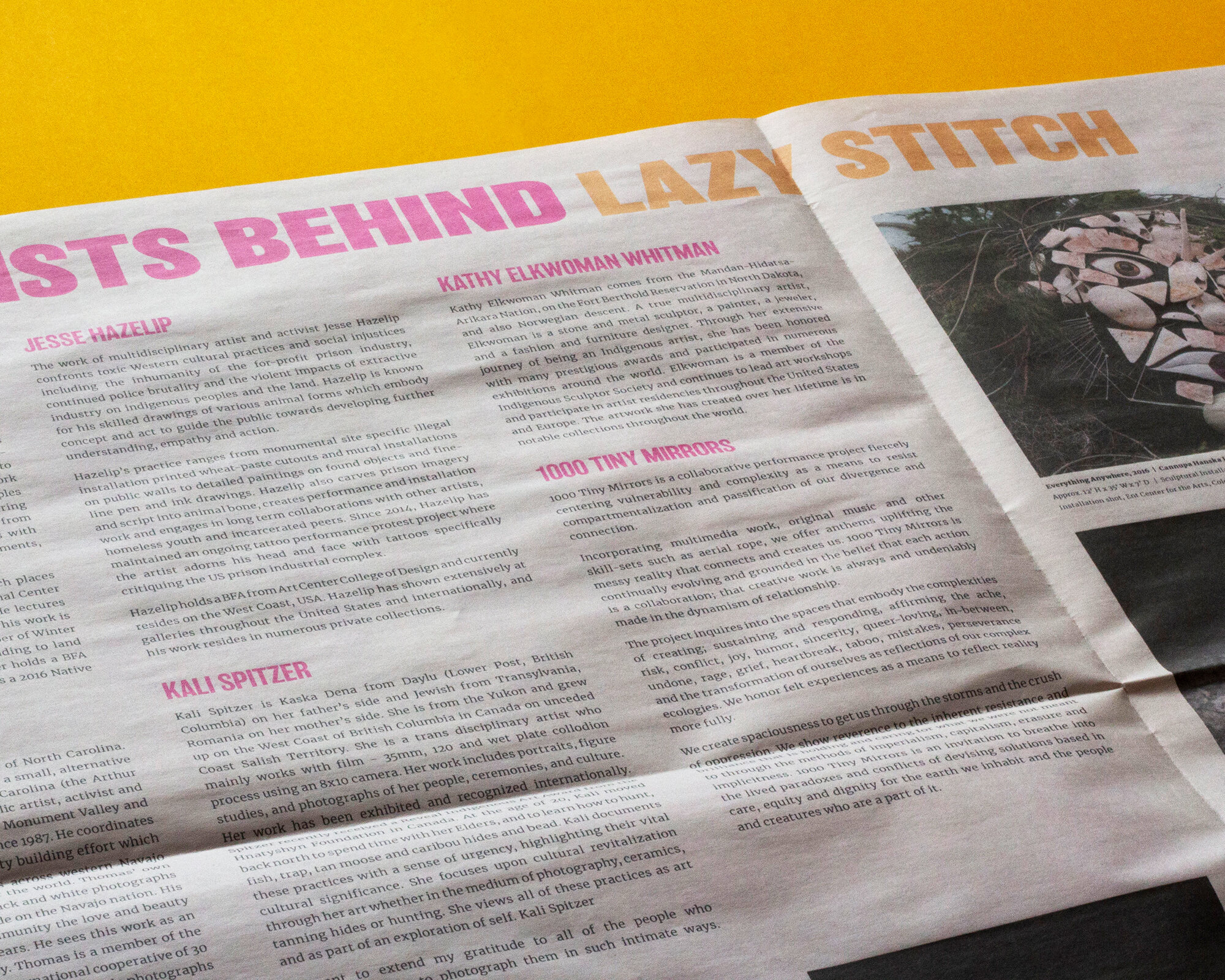
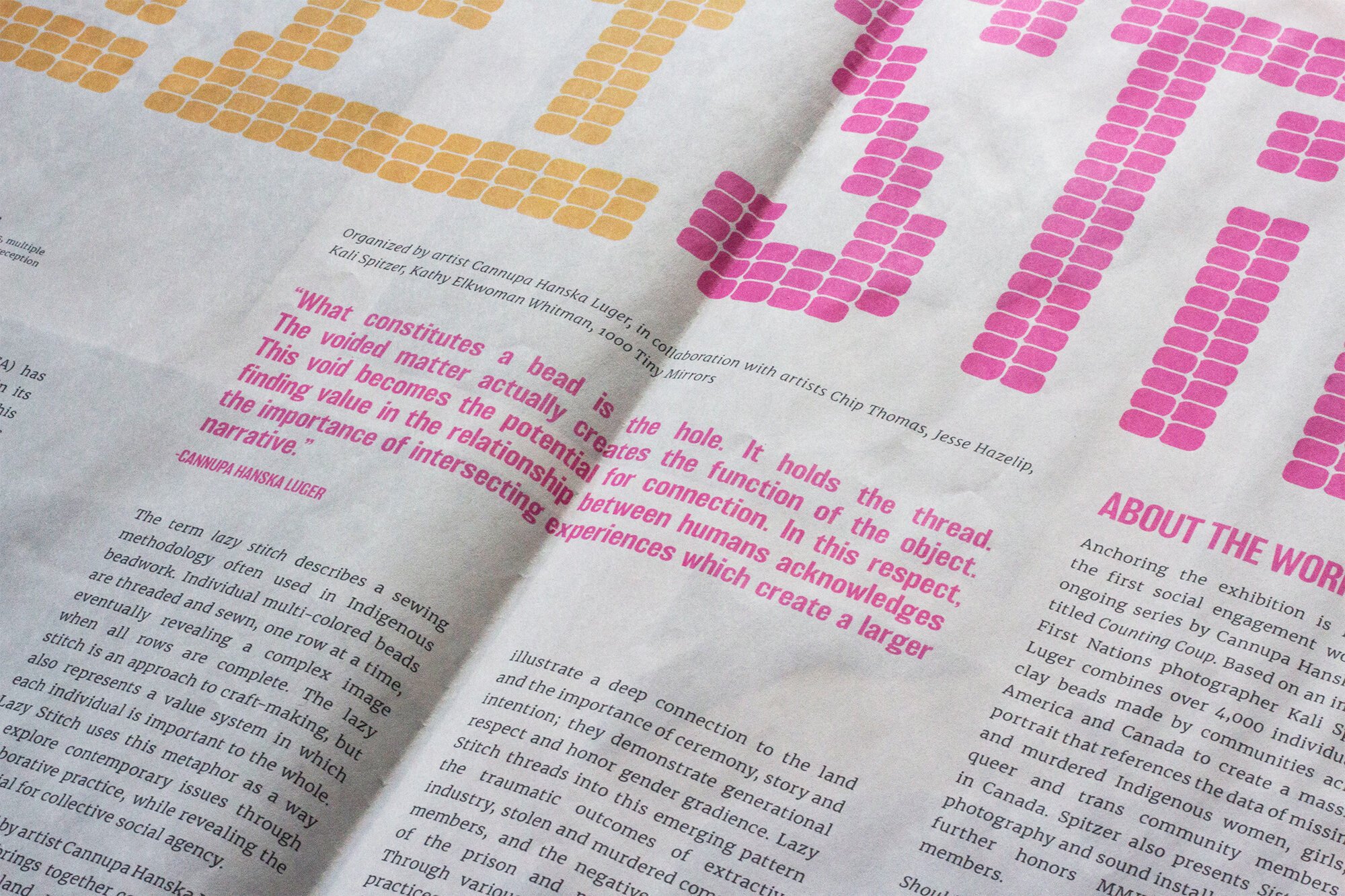
Lazy Stitch was conceived by artist Cannupa Hanska Luger and featured work from artists including Chip Thomas, Kali Spitzer, 1000 Tiny Mirrors, Kathy Elkwoman Whitman, Jesse Hazelip and Cannupa Hanska Luger.
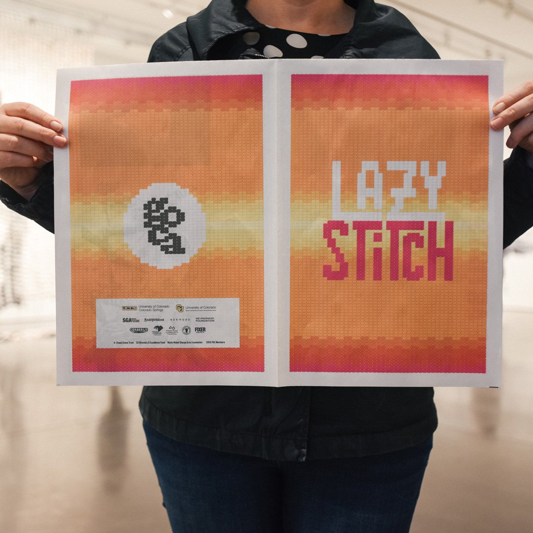
The term lazy stitch describes a sewing methodology often used in Indigenous beadwork. Individual multi-colored beads are threaded and sewn, one row at a time, eventually revealing a complex image when all rows are complete.
We created the event titling mark for the exhibit by translating this craft methodology into a visual design, including a background and interpretation of the GOCA logo in the catalogue for the show in a broadside newspaper format.
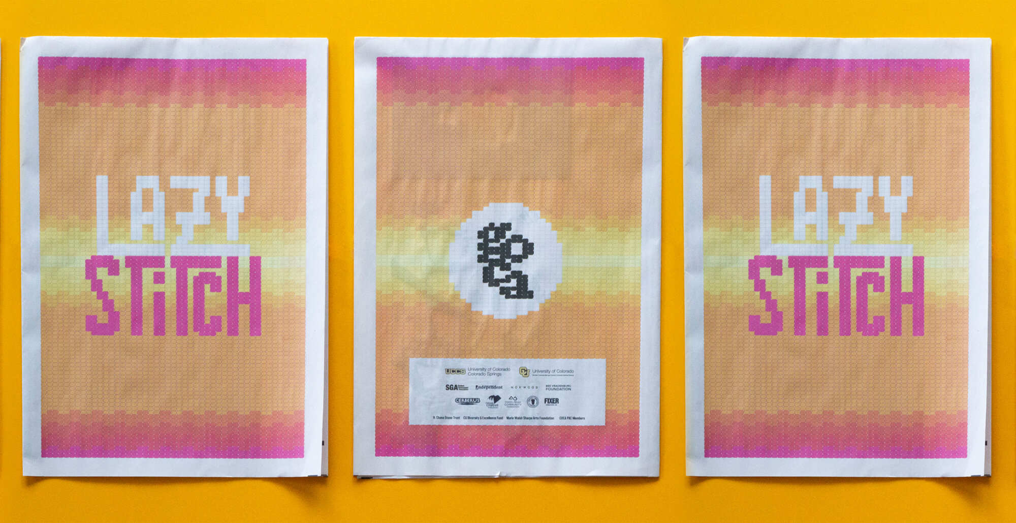
The lazy stitch is an approach to craft-making, but also represents a value system in which each individual is important to the whole. Lazy Stitch uses this metaphor as a way to explore contemporary issues through collaborative practice, while revealing the potential for collective social agency.
The Lazy Stitch exhibit brings together five contemporary artists across land, race, culture, gender and time to investigate intersecting human experiences.

Collectivity
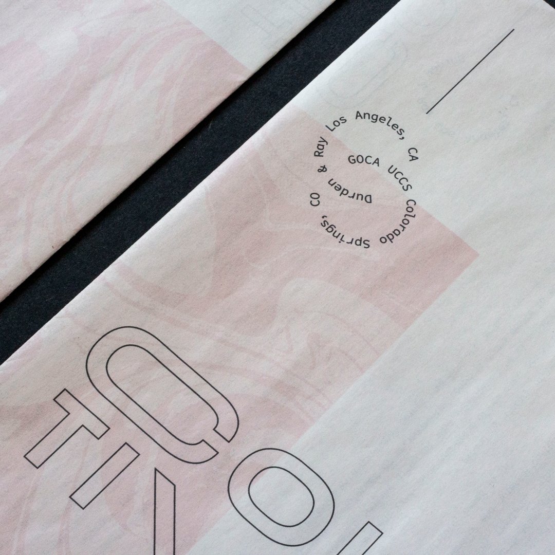
Collaboratively curated by GOCA Director Daisy McGowan and Durden and Ray artists Lana Duong and David Spanbock, "Collectivity" explored the intersections and connections between 24 artists from two collectives in the Western U.S., in back-to-back exhibits across two states.
The exhibit branding was inspired by the idea of artist collectives being as varied in their scope as the individual artists themselves, and in conversation with the branding of the L.A. exhibit catalogue. This catalogue was produced in the broadside newspaper format.



Color Theory
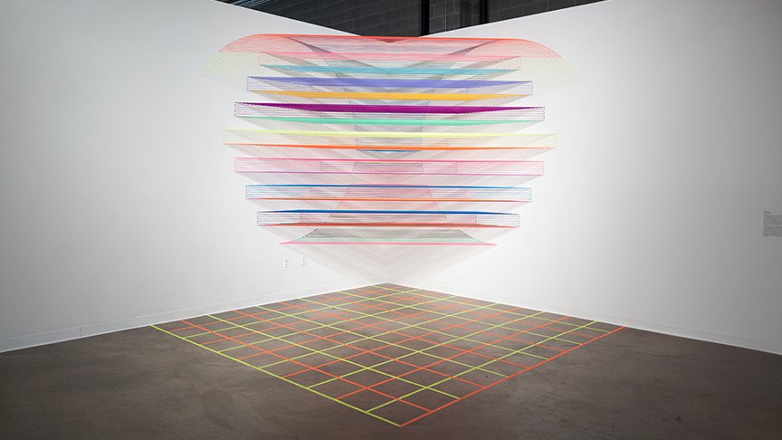
Color Theory featured three Colorado-based artists whose paintings and sculptural installations intersect color and mathematics, and the relationships between physics, math and color. The exhibition included a monumental installation inside the Ent Center for the Arts.


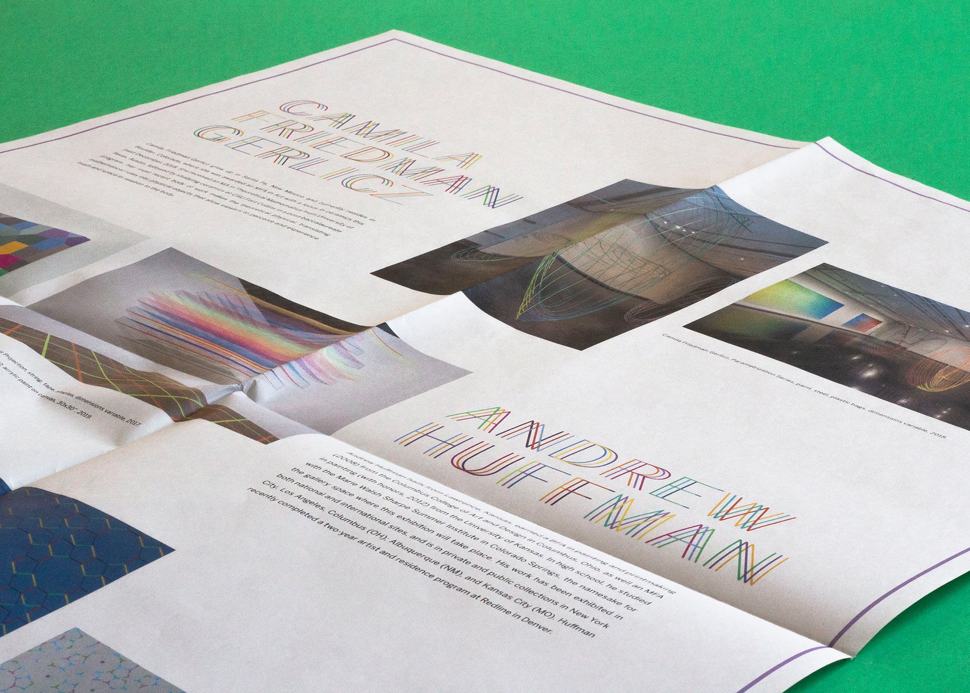
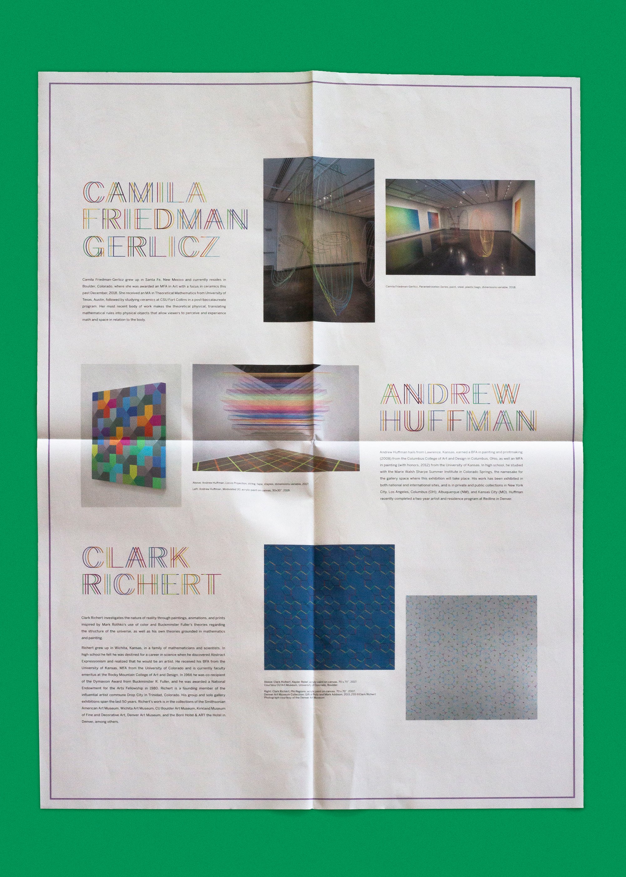
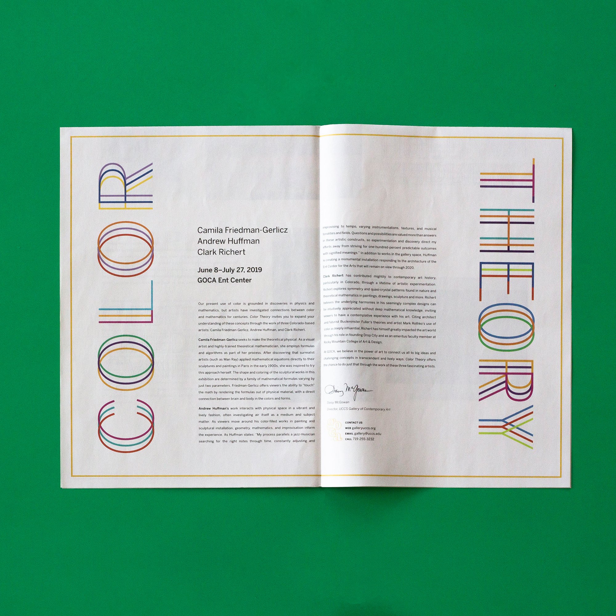
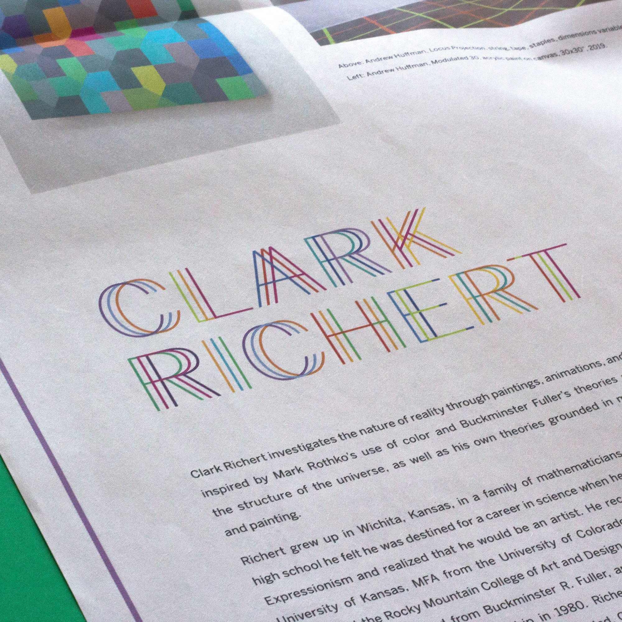
From the primary exhibit titling, we created a custom titling treatment for each artist in the show — cohesive, yet distinct.


